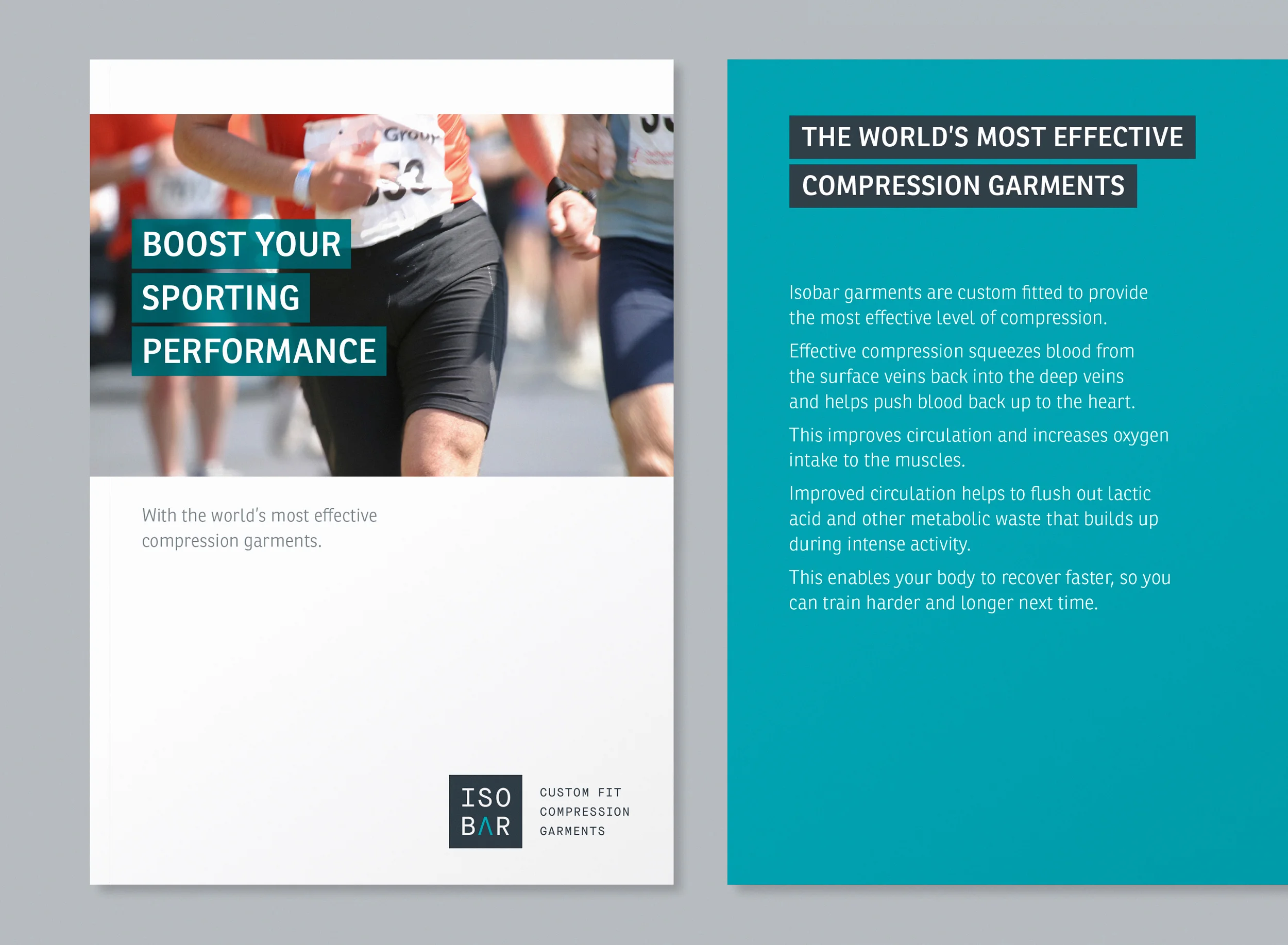
Advanced Therapeutic Materials have spent the last decade developing Isobar – the ultimate compression garment. Medically and technologically superior, but without a brand identity to match. We worked with them to develop their brand, and they are now endorsed by some of the world's top athletes and are growing in the sports, travel and corporate markets.
Collaborative Brand Strategy
We developed a Brand Strategy in workshops with the management team, and then used that as the basis for developing a new identity, working with our design partner Ian Whalley, that expressed the technology and did justice to the product.
Illustrations and patterns
We designed original illustrations for the website, set on a background using distinctive brand patterns. These brand patterns derive from Isobar's 3D scanning techniques that enable them to create compression garments to the exact topography of people’s limbs.
Brand Identity
The new brand identity was designed around the insight that Isobar helps pump blood back up to the heart more effectively than any other compression garment, with the A becoming an upward pointing arrow.
Brand benefits
We developed graphics to show, simply and clearly, the core Isobar benefits
Website
To show the new mission we redesigned the Isobar website - focussing on simplicity and the clear explanations and advantages of the Isobar technology.
Inspired by Isobar's heritage in material science and clinical research the website was designed to look, feel and sound like you’re having a consultation with a leading vein surgeon or a top club physio – a clinical expert able to explain compression in simple, everyday language.
Marketing Materials and Packaging
We also designed marketing materials and packaging, keeping the messaging simple and clearly focused on the core benefits that are the foundation of the Isobar value proposition.


